Where’s the Buzz :New Google Favicon

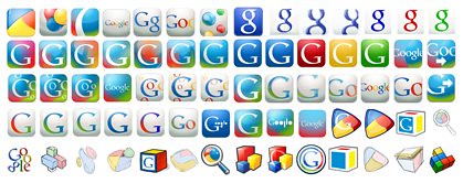
Did you notice the new Google favicon lately? The big “G” turns to little “g” after 8.5 years.
Marissa Mayer, Google VP explains
“We wanted to develop a set of icons that would scale better to some new platforms like the iPhone and other mobile devices. So the new favicon is one of those. We tried in total more than 300 permutations. It was much harder than we thought at first. We wanted something distinctive and noticeable, so we aimed toward transparency or semi-transparency, so the image would have a more distinctive noticeable shape than just a block. We wanted something that embraced the colorfulness of the logo, yet wouldn’t date itself. Since we don’t really have a symbol that means Google, we felt it best to work with the logo and letters within it. Our design team tried literally hundreds of approaches”

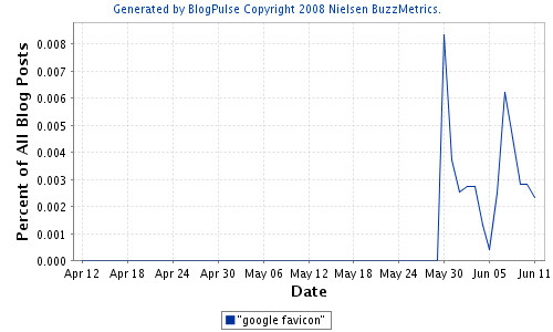
With billions of Goggle lovers across the globe even a small change is sufficient to create rants, ripples and rumours in the blogosphere.

Some interesting rumours :
“The new favicon looks like an 8, which is a good omen in China”
“The new Favicon is a symbol for infinity (?). What stands for the amount of search results google has.”
“Looks to me like they’re encouraging the use of “google” the verb vs. “Google” the company”
“The new google favicon it’s not just a lowercase “G”, it’s also the “android” icon, if you carefully look at it, you could see the chest+neck+head+hair (sort of msn one) and this means they are pushing the company and project to a more popular and massive one, putting them to the same level of us.”
Overall , majority strongly hated the new Google favicon.
“It’s UGLY! Please my beloved Google bring us the previous one back!!”
“Not cool, why would Google mess with their favicon?”
“I just noticed it today and I don’t like it. The other “G” favicon was much better, and easily recognizable as the “G” in Google.”
“new sucks (“
“Old one was MUCH better! 🙁 Why Google, why? “
“I don’t like it either. And as I work with several tabs it’s more difficult to identify it with this grey background. This change is not user friendly.”
“Very ugly favicon, it’s like purple fat demon with singel horn, please change it back, google, I hate it!!!!!”
Infact the new Google favicon resembles Gee Gain & Guardian favicons .

Merrisa Meyer continues “By no means is the one you’re seeing our favicon final; it was a first step to a more unified set of icons”
Google is infact trying a crowdsourcing approach to arrive at the next set of favicon. What do you have to say on the new favicon?.
![]() Tweet This Post
Tweet This Post ![]() Plurk This Post
Plurk This Post ![]() Buzz This Post
Buzz This Post ![]() Delicious
Delicious ![]() Digg This Post
Digg This Post ![]() Ping This Post
Ping This Post ![]() Reddit
Reddit ![]() Stumble This Post
Stumble This Post


![Validate my RSS feed [Valid RSS]](http://www.trendsspotting.com/blog/wp-content/images/valid-rss.png)


March 2nd, 2009 at 8:08 am
[…] original uppercase ‘G’ to small ‘g’ after 8.5 years. At that time, Marissa Mayer, Google VP explained that the new favicon was responding to the need to better adapt to new platforms, especially to […]